People often think that expressive typography and accessible typography are a trade-off. They are not. This page explains how the plugin prevents the problem.
What is the problem?
To style single letters, the plugin puts them in separate elements. Some screen readers read those boundaries as word boundaries. They read the parts as separate words, for example “Sa” and “rah” for “Sarah”. The more decorative the typography, the worse the problem.
The usual workaround is worse. Designers set the headline in a graphics program and use it as an image. Then the text is not selectable, searchable, or translatable. It does not reflow, and a screen reader cannot read it.
How does the plugin solve it?
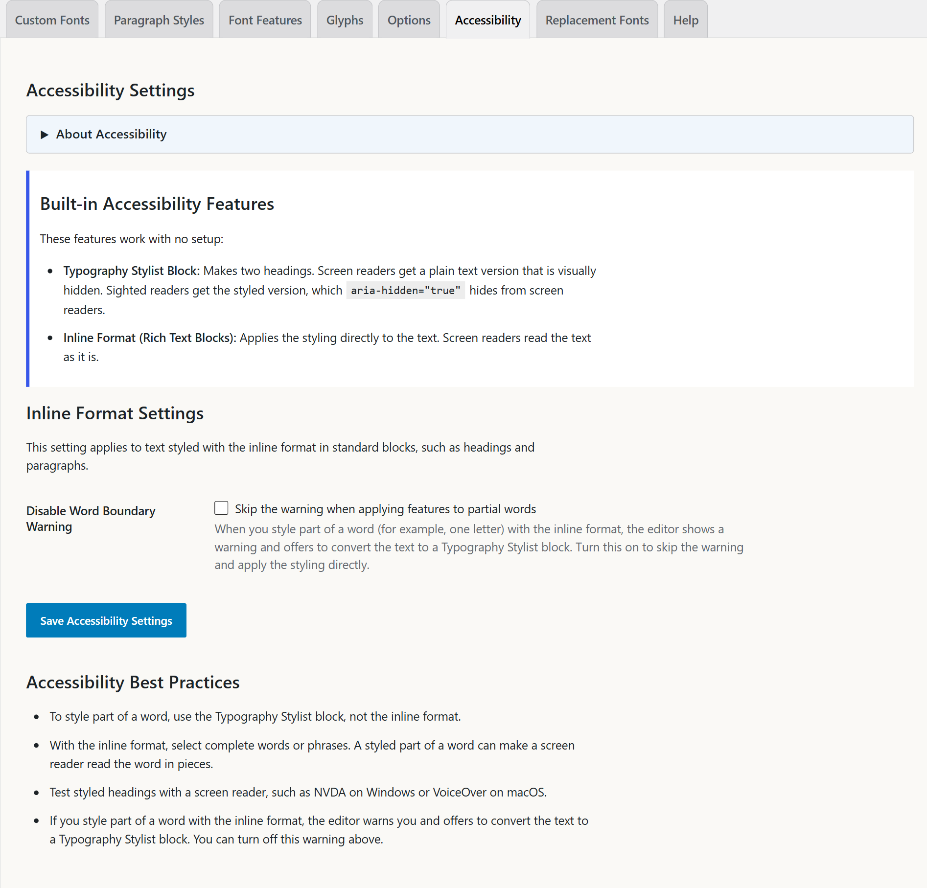
The Typography Stylist block shows your text two times:
- A plain heading. It is visually hidden, but assistive technology and search engines can read it.
- The styled version. It has
aria-hidden="true", so screen readers do not read it.
A screen reader gets one plain heading. A sighted reader sees the typography. Both get the full content, and the text is still text.
What is the screen reader class?
The screen reader class hides the plain heading visually, but assistive technology can still read it. Select the block. In the sidebar, open Accessibility and choose a Screen Reader Class: visually-hidden, sr-only, screen-reader-text, or Custom.
The plugin includes the CSS for the first three. If you choose Custom, type the class name. Your theme must define that class, or the plain copy shows on the page.
Why the partial-word warning?
The inline format cannot make two copies. It styles the text in its block. So when you select part of a word, it shows a warning. It offers to convert the block to a Typography Stylist block, which can make two copies.
To turn off the warning, go to Settings → Typography Stylist → Accessibility. Select Skip the warning when applying features to partial words. By default, the warning shows.
Does hiding text hurt SEO?
No. This is the correct use of hidden text. The hidden text is the accurate content, and the visible text is the same words with styling. Nothing is hidden that a visitor cannot see. There are no extra keywords. The plain heading is what search engines need.
Is the editor accessible?
Yes. The editor panels are dialogs with names. Focus stays in an open panel. Each control has a name. The Move panel, use arrow keys button moves a panel with the keyboard. The editor tip has a Dismiss tip button. See Using the editor panels with a keyboard or screen reader.
What else should I check?
The plugin protects screen reader output. It cannot make every design decision for you. Check these items yourself:
- Contrast: Decorative type often has less contrast than you expect.
- Size: A swash font at small sizes is hard for all people to read.
- Letter spacing: Very tight letter spacing makes text harder to read for people with dyslexia.
- Meaning: Do not use a decorative alternate as the only way to show a difference.